Tl;dr: Don’t do this.
Last week was our first official project week at General Assembly WDI. The challenge: build a tic-tac-toe game in JavaScript that uses AJAX to interact with a Rails API.
I got my basic logic up and running on Wednesday, and on Thursday, I decided to tackle UI. I grabbed a color scheme from an ad for Two Dots, picked out a font, added some nice border radii on a couple of elements, and used a couple of dot-like Font Awesome icons as my game pieces. Overall, I was feeling pretty good about my overall aesthetic:

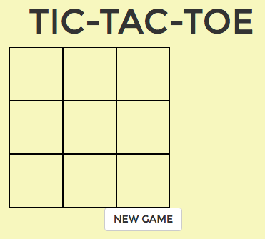
And then I took a look at my game board:

Yeah.

It wasn’t time to panic—I could fix this! All I needed to do was to give the board a background, round its edges board, remove the outside border, thicken up those grid lines a bit, and—the final touch—round the edges of the grid lines to better match the overall feel of the game.
I thought about doing this in CSS, but Googling didn’t turn up a way to put round endcaps on border lines in CSS. Rather than wasting time (HA. HA HA HA. This is the part where there’s a freeze frame, and you remember that I said this for the rest of the story for it will prove to be ironic.), I decided to open up Photoshop and make a background image that I could drop into the game board div and be done with it.
Teensy problem: I don’t currently have access Photoshop, a fact I remembered late Thursday night.
I was faced with two options: research open source / low cost graphics programs, acquire one, learn how to use it. Or: further investigate this stroke-linecap attribute that showed up when I was Googling before.
Given that I identify deeply with this joke about Atom, and that it applies to almost every application on my six-year-old laptop, I decided to avoid installing something new. Time to code an SVG element!
I started with this:
See the Pen SVG Game Board v1 by Rebekah Heacock Jones (@rhj) on CodePen.light
Ooooooh, shiny! I was feeling excellent about this until I realized that it was getting later, and I wasn’t sure how to adjust the size of the rectangle and the positions of the lines dynamically at different screen sizes. (I didn’t yet know about ViewBox.)
Solution: pull all the SVG code into a separate file. Apply inline styling. Use the SVG as a background image on your game board div. Go to add/commit, and realize that the provided template for your project includes SVG files in its .gitignore, which you’re too afraid to overwrite because you don’t know why that choice was made in the first place. Export to PNG using SVGtoPNG.com. Since you’re now using PNG, which doesn’t scale well, make a bigger version of the SVG to use on larger screen sizes, and export that.
Stop awkwardly in the middle when you accidentally do this:
Whoops. #funwithsvg #tictactoe pic.twitter.com/OWNjtoWsWD
— RebekahHeacockJones (@rebekahredux) September 9, 2016
Finally end up using image files like you always intended, only you’ve taken the VERY LONG WAY there.
What’s the point of this blog post? It’s part cautionary tale—be careful not to get so attached to an aesthetic that you end up spending hours on a single, unimportant element of a project (unless, of course, that’s actually your job). There are better ways to do this: use SVG correctly and write the code that makes it scale. Ask your instructor (or your boss) why they don’t want SVG files in your git repo, and see if you can work out a better solution together.
I’m also writing this because it’s a good reminder to myself that I can be resourceful. I had a goal, and I achieved it with the tools at my disposal. And now it’s part of a functional public Tic Tac Toe app that anyone—even you?—can use! All in all: a good day.
Some fun side notes: while writing this, I ended up using git checkout [commit hash] to (temporarily) go back to an earlier version of my code, pre-svg, so I could grab screenshots. The Atlassian tutorial on Reset, Checkout, and Revert has an excellent explanation of how to do this.