Squeaking this one in under the wire—the last two weeks have been a whirlwind (I expect I’ll be saying this for a while)!
Last Monday was a holiday. Tuesday was a normal class day. Wednesday through Friday were allocated for work on our first project: a single page Tic-Tac-Toe game built in JavaScript and jQuery, using a Rails API for user authentication and game data storage.
To sum up:
Let’s start at the very beginning, with Tuesday’s class on CSS and SASS:
Day 11
SASS (which GA teaches) and LESS are probably the two best-known CSS preprocessors, but many others exist. We didn’t talk much about the pros and cons of different options, but based on some quick Googling:
- SASS is written in Ruby; LESS is written in JavaScript.
- SASS seems to have more available tools to help developers: frameworks like Compass, mixin libraries like Bourbon. LESS has libraries, too, but they’re not quite as powerful and less cohesive.
- SASS offers selector inheritance via
@extend, which is pretty sweet. - SASS has better logic than LESS, which is fairly limited.
Fun fact about colors in SASS: the native lighten and darken functions aren’t stellar—they move pretty quickly into complete white/black, rather than tinting or shading things gradually. To fix this, you can use mix to adjust your colors with a bit more control. You can also write custom tint and shade functions that mix colors with white and black to lighten or darken more gradually.
A CSS style best practice I didn’t know before: you should sort your rule declarations by property name in alphabetical order.
Days 12-14: Project Work
First tic-tac-toe project work day at @GA_boston WDI! Have already played more rounds today than in my entire childhood. #suchexcite
— RebekahHeacockJones (@rebekahredux) September 7, 2016
The assignment was fairly simple: build a single page JavaScript-based Tic-Tac-Toe game that:
- renders a game board
- alternates turns between X and O
- shows in the browser who’s won at the end of the game, or identifies the game as a tie
- allows the user to play multiple consecutive games
- uses AJAX to interact with a provided Rails API to
- handle authentication
- store and retrieve game data
My instinct when we got the assignment was to start downloading and playing as many mobile games as possible. I knew I wanted my game to be responsive—who really wants to sit with a laptop and play game after game of Tic-Tac-Toe? It seems like something to do on the train, or while you’re waiting in line for your (much-needed) coffee. Looking at mobile games to identify examples of clean design and intuitive user interaction felt like a good place to start. (The final UI is heavily inspired by the Dots.co family of games, which are among my favorite mobile games for their design, which feels colorful without being overwrought, and their fluidity.)
In hindsight: I wish I’d spent more time thinking about my data models, key functionality, and game logic first. I wrote a handful of user stories and spent a lot of time playing tic-tac-toe and diagramming win conditions, and I didn’t start *coding* the design until I had was able to authenticate users, play games, and log them to the server, but even as I worked on those things, I kept having to stop and reorganize my code to accommodate new features. Taking an hour or two to try to diagram the flow of logic and the exact points at which I needed to interact with the server would have brought more helpful structure to my approach and, I think, kept my code more elegant.
That said: I’m pretty proud of what I built in the span three five days (counting a few hours each on Saturday and Sunday):
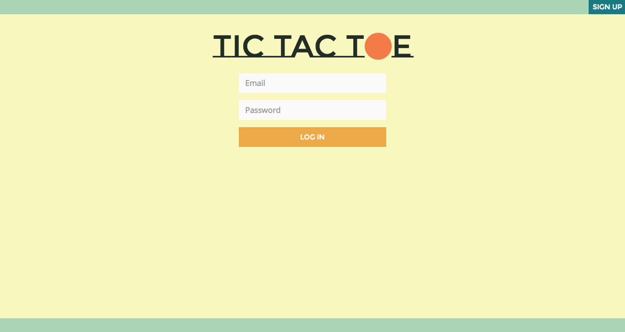
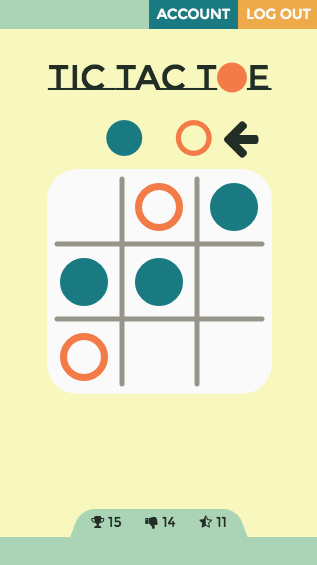
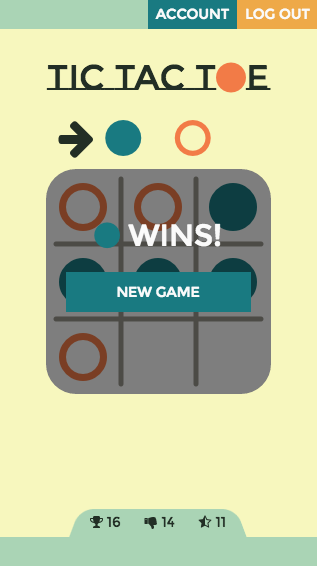
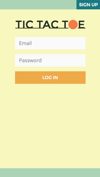
Give it a whirl here (and please do let me know if you find any bugs!), or check out the code on GitHub.
Things I learned: I wrote a bit about my adventures in game board design earlier. As I built the functionality, I got some great practice with AJAX (including learning how to pass additional data to AJAX callbacks), and as I styled, I learned how to make a sticky footer. I also learned that it’s shockingly, embarrassingly easy to keep reverting to “x and y” instead of “x and o.” Warning to future tic-tac-toe game developers: this will cause you at least an hour of distress.
Current status: I’m midway through fixing a few small bugs, and I’m still waiting to hear feedback from my instructors at GA—I’m planning to ask them about ways to refactor/restructure and make my logic and flow a bit more elegant.
And my last takeaway: I CAN’T WAIT to learn how to do test-driven development. The single most frustrating part of building this app was having to test each feature manually every time I changed something. I tried to keep careful track of what I needed to test each time, but I *know* I missed things—as evidenced by the remaining bugs in my game—and the process was prone to error (see: manual). I’m not sure if GA teaches TDD explicitly or not, but tests are built into some of the repos they use in training, and I’ve started to track down the frameworks they use (Rspec for Ruby; Mocha and Chai for JavaScript). (In writing this paragraph, I learned about TDD vs BDD. So many things to explore….)
On to week 4 (which is coming to a close today, so expect another recap soon!)!
